Guide designed by: Hallie Sholar
Swifty’s
Collaboration branding project to create a new grocery store that applies to the new Covid-19 regulations. As a team we created the logo and theme. My focus was product design and uniforms.
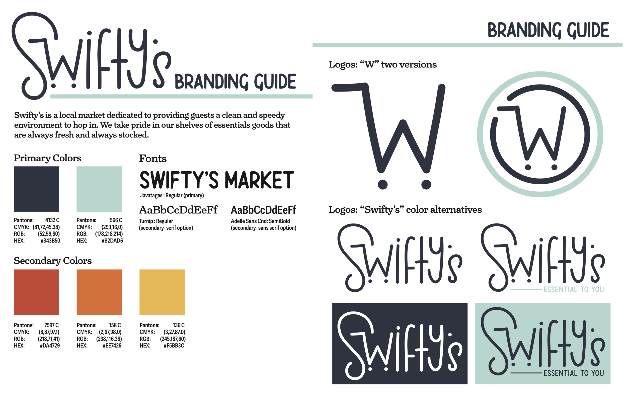
As a group we wanted the store to resemble sterile cleanliness, but not remind the customers of a doctor’s office. Our primary colors are pastel teal and navy blue, accompanied by our choice of vibrant secondary colors. The blues create a sterile feel and the bright colors create an uplifting mood.
We mainly use soft edges and curved lines to maintain a fluid, welcoming tone.
Uniforms


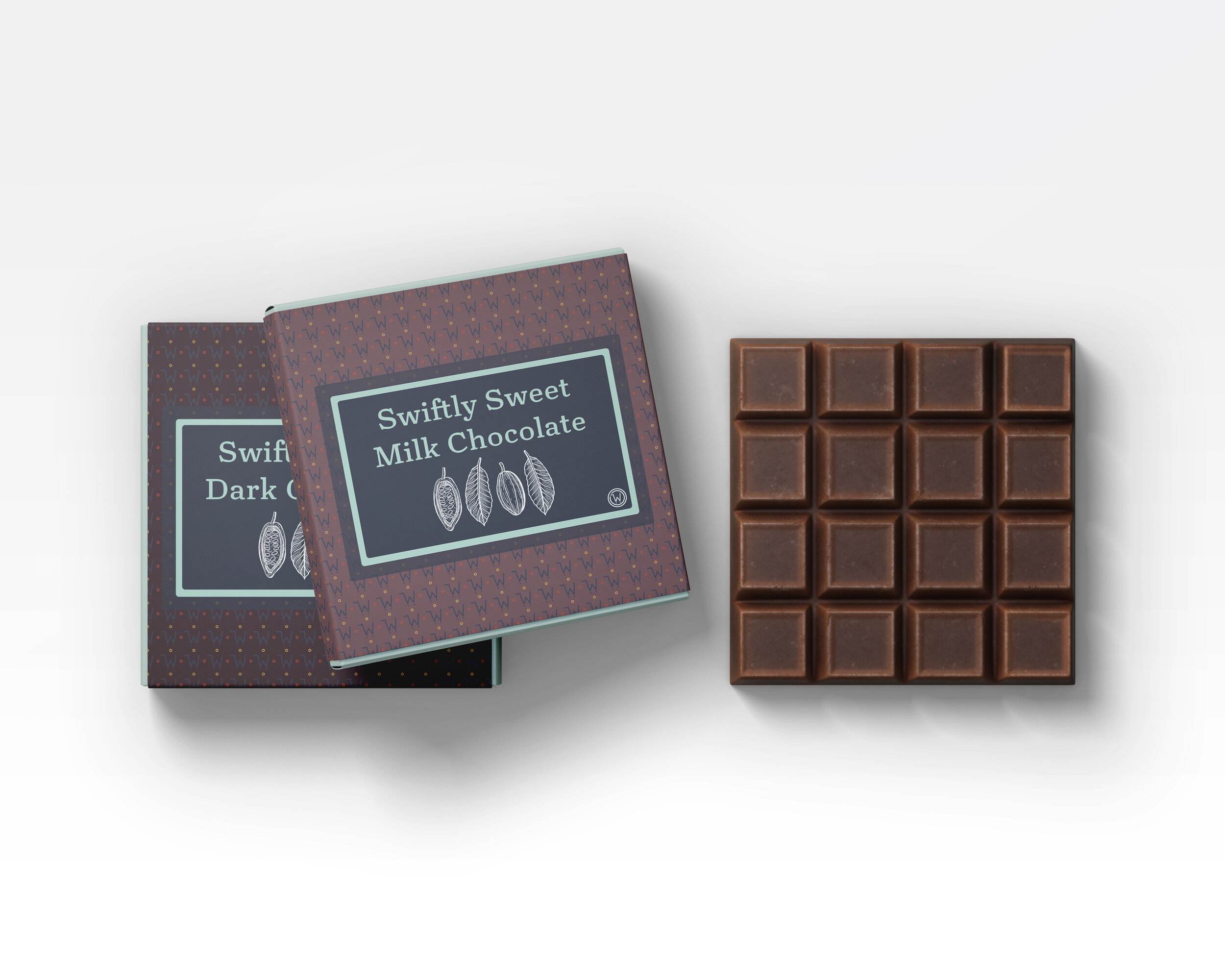
Products/ Packaging


